September 30, 2015

Gothic Gala Lacquers Holo-Deck Collection

I'm a Trekkie.  I like the new reboot movies and I've seen most of the original movies (minus the ones that were evidently so horrible that my Dad banned them from the house as I was growing up), and I'm not too proud to admit that I watched a handful of Enterprise back in the day, but I am a Next Generation girl through and through.  The show may have ended when I was three, but I grew up watching reruns and taped episodes.  (Remember the days of VHS?)  When I was in elementary school I got in an argument over whether Star Wars or Star Trek was better, and I almost ended a friendship over someone thinking it was called "Star Track."

So when Gothic Gala Lacquers announced the re-release of their Holo-Deck collection, I was ecstatic!  I'd seen pictures of it from when she first released it a year ago and I was really disappointed that I'd missed it.  The moment I saw the photos on her Facebook page I knew I'd need the entire collection.  At first, I thought it would have been inspired by either the original series or the reboot, so I was extra excited when I saw the names and realized that this collection gathers its inspiration from Next Generation!

This post is going to be incredibly photo-heavy, because I couldn't resist capturing tons of macros of these amazing polishes.  To save a little bit of time, the formula on these polishes is all pretty much the same: opaque at two coats, a tiny bit streaky but evens out perfectly with top coat.

Make It So


Inspired by Captain Jean-Luc Picard and his favorite way of issuing an order, Make It So is a lovely raspberry-red scattered holo.  It's a bit less raspberry and more true red in sunlight, but inside it definitely has that juicy, berry-red look to it.


The holo effect is pretty subtle in the light of my lamps, but take it outside and WOW!  Truly stunning.  I hadn't had enough holos in my life until now.  I'm very happy that I bought this collection in its entirety!


My Partner In Crime


This mustard-y yellow polish is inspired by the character Geordi La Forge.  Normally I wouldn't be crazy about this shade of yellow, but it is absolutely the EXACT shade of yellow that Geordi and the other engineering officers wear in Next Generation, so I love it.


The holo effect is much more subtle than Make It So.  Unfortunately I didn't have any direct sunlight when I swatched this one, but you can see it pretty well in this bottle shot:


The Enterprise


It should be pretty obvious what the inspiration behind this polish is - the Federation Starship Enterprise herself!


The Enterprise is a lovely shade of gray.  Inside, whether under artificial light or indirect sunlight, there's a hint of purplish undertones to it, though my camera didn't really pick that up.  The holo sparkle is absolutely brilliant!


It's Green, Sir


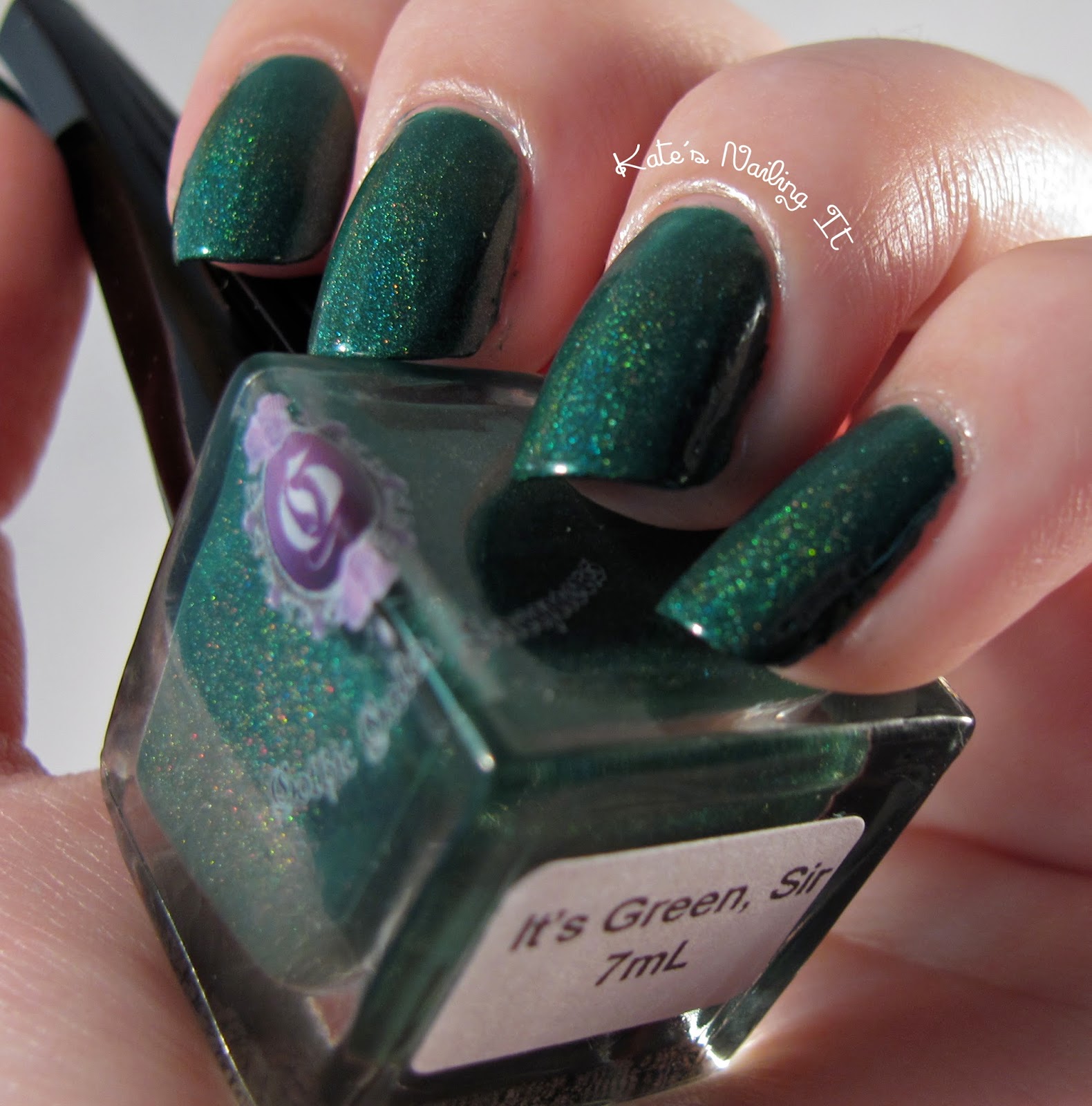
This lovely forest green shade is inspired by Data.  (If it's inspired by Data, shouldn't it be called "It Is Green, Sir"? hehe.)  Data has been my favorite character for my whole life.


This shade of green is super versatile.  I can see it working perfectly for a Spartan green-and-white mani, a Christmas mani, and pretty much any time I need a holographic green.  It's a totally true green - doesn't really lean yellowish or blueish.

Are you ready for this storm of macros?


The Dancing Doctor 


Inspired by Doctor Beverly Crusher, The Dancing Doctor is a gorgeous shade of blue.  Like It's Green, Sir, it's a true blue that doesn't really lean greenish or red - although in some lighting, it does exhibit ever-so-slightly blurple undertones.  But in most lighting, it's very very blue.


And the holographic sparkle is quite pronounced, even in dimmer lighting!  I love it.


When taking macros of this one, I thought perhaps I was moving too much and that's why the sparkles never appeared to be in focus.  But I think that the holo dust in Dancing Doctor is actually shaped like little Ts!  They looked like that in every macro, no matter how still I held my hand.

I thought I'd try out a new angle for a macro shot - what do you think?

The Search For Spock


The Search For Spock actually takes its inspiration from the original series - it shares a name with the third Star Trek movie.


Oh. my. goodness.  This polish is absolutely 100% breathtaking.  It has some small flakie glitters that none of the other polishes in this collection have, and it totally looks like space.  It's like a one-step galaxy mani!  I'm totally in love.  The holo effect is the most prominent in this one, reflecting rainbows even in dim indoor lighting.


The formula was a tiny bit thinner than the others - it was mostly opaque at two coats, and while there wasn't really a visible line where the whites of my nails start, it definitely looked lighter at the tips of my nails.  I used three coats of The Search For Spock in the photos.

This collection is sadly no longer available in Gothic Gala Lacquer's shop as of 9/20/15, but who knows, maybe Gothic Gala will reboot these beauties again in another year!  If you missed out on these, I highly recommend checking out some of Gothic Gala's other holo polishes - I haven't used any myself, but judging by the photos, they all look just as incredible as these six.

Which polish from this collection is your favorite?  Are you also a Star Trek fan?  Let me know in the comments!

September 23, 2015

Creative Cuticles Nail Polish: Creepy Cocktails collection

I have an awesome indie collection to share with you guys today!  You might remember seeing some of Creative Cuticles Nail Polish's Christmas polishes on the blog last winter; now, I have all 3 of her Halloween polishes to share with you!  I did receive these polishes in exchange for an honest review, and I want to assure you that I didn't promise to say anything in particular.  These words are my own and the fact that I didn't pay money for this nail polish doesn't influence my opinions in any way.

The Creepy Cocktails may have Halloween-y names and are perfect for Halloween manis, but they're also super versatile for any time of year!  As much as a love a good Halloween-themed glitter, I equally love a polish that I can use in anything.

O Negative, Please


The perfect blood-red nail polish, O Negative, Please is the most opaque in this collection.  Two coats was fully opaque with no VNL peeking out.  The formula is creme, but it felt like it leaned a tiny bit on the crelly side to me.  It's just so juicy looking, something I usually only see in jellies/crellies!

I don't really know what's going on with my ring finger in this picture; it looks a lot darker to me.
I guess maybe that finger was accidentally pointed out of the light, or something, I don't know. 

Witches Brew


Witches Brew is a beautiful dusty purple, perfect for fall and the ultimate shade of Halloween purple!  Two coats was mostly opaque for me, but there is still just a tiny bit of VNL.  It's not as noticeable in normal lighting, though - the lights I use for these photos are super bright, so the whites of my nails tend to stand out more than they do in other lighting.  The formula is very similar to that of O Negative, Please - a juicy, crelly-leaning creme.


My camera picked up this color a little weirdly, so I had to cool it down by adding some blue to the photo for color accuracy.


Ooze On The Rocks


I love the name of this one!  Ooze on the Rocks is a wonderful slime-green, absolutely perfect for Halloween manis but also great for any of your bright green needs.  This one is a true jelly, so it's the sheerest of the bunch.  I have three coats shown on my nails, and you can see that there is still just a hint of VNL.  Again, that VNL stands out more under my photo lamps than in other lighting, but if you want a fully opaque mani, I recommend either layering this on top of white or building up to four coats.


These polishes are set to release on October 1 in Creative Cuticles Nail Polish's shop.  Will you be adding these ones to your collection?  Do you have any favorite, must-have Halloween polishes or mani designs?  Let me know in the comments!

September 16, 2015

Do I Need Them All? Zoya Mikka, Shivon, and Haven vs Julep Elle

Welcome to this month's edition of Do I Need Them All!  Since it's September, I thought I would start looking at deeper, more autumn-y colors.  Today we'll be looking at four purples: Zoya Mikka, Haven, and Shivon, and Julep Elle.  All of these polishes are at least a year old, but they're all lovely purples that are perfect for this time of year!

From left to right is Elle, Mikka, Haven, and then Shivon.  As always with this series, I have the polishes in the same order on my nails from pointer to pinkie fingers.


As you can see, Shivon is on an entirely different page than the rest of these shades.  It's not as deeply purple as the other three, but I figured it was close enough that it should be included in this post, anyway.  Once you get it on the nail, it's a very rosy purple with flashes of gold, while the other three colors are much more purple and less colorshifty.


These polishes all photographed pretty horribly; no matter what I tried, they just came out looking brownish or blackened.  I did the best I could to edit the photos for color accuracy, but they're still a little bit off.  I know Elle, Mikka, and Haven all look pretty much identical in this photo.  There are some subtle differences between the three in person that you'll just have to take my word on.  Be sure to check out the linked store pages for the companies' photos!

Elle and Mikka are similar enough that I think it's safe to say that they're dupes.  Mikka is perhaps a touch more reddish, but barely.  They look the most identical in the bottle as well: they both have a silver shimmer to them, while Haven glistens with a brighter orchid purple.  Between Elle and Mikka, my personal favorite is Elle.

So, Do I Need Them All?  Not really!  Shivon definitely stands out from the other three, but if you only want one deep purple metallic, you'll be happy with Elle, Mikka, or Haven.  Haven's orchid tones make it stand out from Elle and Mikka, but as for the latter two, I would recommend choosing one or the other.

September 12, 2015

Aliquid Lacquer: Egeria

Aliquid Lacquer has a really awesome collection of polishes inspired by ancient Roman mythology and tradition called When In Rome.  She releases one new lacquer every month, and each month's lacquer generally has something to do with that month.  For example, July's polish Neptunalia (which I think I really really need) is inspired by the Roman's midsummer tradition of honoring Neptune, which took place on July 23.

Here's the description of Egeria from Aliquid Lacquer's website:

Egeria was a water nymph and patroness of childbirth, wisdom and prophecy. She befriended Rome’s second king, Numa, and advised him on how to set up the religious and legal practices of Rome. When Numa died, Egeria was transformed into a spring, which people would visit to ask for her inspiration.


So that explains why the polish Egeria looks exactly like a beautiful, sparkly pond.  I absolutely love the holographic glitter in this.  And the non-holo pink glitters break up the holo sparkle just enough to prevent you from getting totally lost in the sparkly reflections - just like a lily would do in a real pond!  Egeria actually reminds me a little bit of Monet's Gardens by Emily de Molly - an Australian indie polish that I've been coveting for over a year but always seem to miss out on through EdM's stockists that ship to America.  Owning this polish satisfies my needs of having a pond on my nails. <3

woohoo, holographic glitters!

As far as application goes, Egeria is quite nice.  I had to dab a little bit in order to get an even distribution of glitter across my nails, but the jelly base is thin enough that I didn't end up with any awful globs of polish anywhere.  (Well except for on the inner corner of my pointer finger, but that's because I accidentally got too many glitters stuck there.)  I did end up with a small thin spot near the cuticle on my middle finger, which I didn't notice until I was taking the photos - so be aware of that if you use this polish.  Just make sure that you cover all parts of your nail on every coat and you'll be fine!

so dense with glitter!!!
  
Two coats of Egeria is pretty much opaque, but there was a tiny bit of VNL, so I built up to 3 coats on my pointer and pinkie fingers.  My middle and ring fingers just have 2 coats.  What's really great about the thinness of the jelly base is that 3 coats doesn't look ridiculously thick on my nails.  Sometimes, when I use 3-4 coats of a glitterbomb for opacity or glitter depth, my nails end up looking kind of spherical, but that definitely didn't happen here.


I had to take the photos for this polish on my phone, because my Canon camera absolutely did not want to pick up the color.  The pink glitters showed up all right, but the teal base might as well have been gray for all my camera cared!  Yuck!  I really prefer the photo quality of my camera, but sometimes, sacrificing pixel count and focal length is necessary to show color accuracy.


I've never known much about Roman mythology, except for my highly biased opinion that they stole their ideas from the Greeks.  But the When in Rome collection is educating me on Roman mythology one month at a time, and teaching me that they had a lot of very unique gods, goddesses, spirits, and traditions!

What do you think of this polish?  Who's your favorite Roman mythology character?  Which When in Rome polish is your favorite?  Let me know in the comments!

September 2, 2015

OPI Pineapples Have Peel-ings Too

Remember back when I swatched two colors from OPI's summer 2015 collection, I said that Pineapples Have Peel-ings Too looked kind of awkwardly awesome and that I might get it eventually?  Well, I got it.  Let's take a look!


My first assessment that Pineapples Have Peel-ings, Too was awkwardly awesome turned out to be pretty accurate.  The yellow-gold metallic base is really great, but the glitters are a bit awkward.  They get kind of drowned out by the base, and oh my goodness they smear so easily.  That tends to happen with large glitters, but these are a pretty medium size.  Most of the indie glitter polishes that I've used with glitters of this size are a bit more cooperative.  But the base is thin and forgiving enough that dabbing the glitters around didn't make it super lumpy and gross-looking, so that's a plus.

The setting sun streams beautifully into my living room this time of year.  Unfortunately I was a dolt and didn't reset the white balance on my camera, so the color is a little bit extra yellow in this picture.  But it shows off the sparkle in this polish so well that I wanted to show it to you anyway!  The sparkle is almost holographic in the brightest of lighting - you can really see the rainbow shimmer in the bottle between the letters P and I.


I'd really love to have this base color on its own!  It's an absolutely flawless metallic, very up to OPI's formula standards.  It's thin, but not watery; opaque at two coats; and it dries quickly, but not so quickly that it gets goopy while you're applying it.  It dried to an almost-semi matte finish, but barely.  A matte top coat would probably suit this polish really well - and you know how rarely I say that!  I like the matte look on cremes and for some nail art, but on top of metallics and glitters I almost always feel that matte flattens them out too much.

What do you think of this polish?  Are you totally done with summer polishes and want to start seeing fall colors?  Let me know in the comments!